
I have looked back at the magazine analysis I did earlier and decided that it isn't as detailed as it should be, I think because it was my first attempt and i was trying to analyse the magazines the best I could, i think i need to do another one to make sure i fully understand the points to think about when analysing a magazine cover.

The masthead of this page really stands out as it is in bold text and the blue text stands out in the grey background. The masthead is placed in the centre and is very large text above the main image. This logo would be very recognisable and would stand out on a magazine stand. There is no date line on the front of this magazine so you cannot see what issue of the magazine is or when the issue is dated. The main image is of Kayne West, it is a close up shot with the camera eye level. The image is large and would easily be noticed on a magazine stand. Next to the main image on the left is the main cover story, the text for that is larger than the rest of the text on the cover and stands out more than any of the other stories. The main cover story is also in 3 different colours, all bold and the colours are easy to see, pink, blue and black. The other cover stories are still in bold text and in colours that stand out however they are not as large and do not detract attention away from the main cover story or main cover image. The bar-code is not on the front of this magazine, it could therefore be on the back of the magazine.
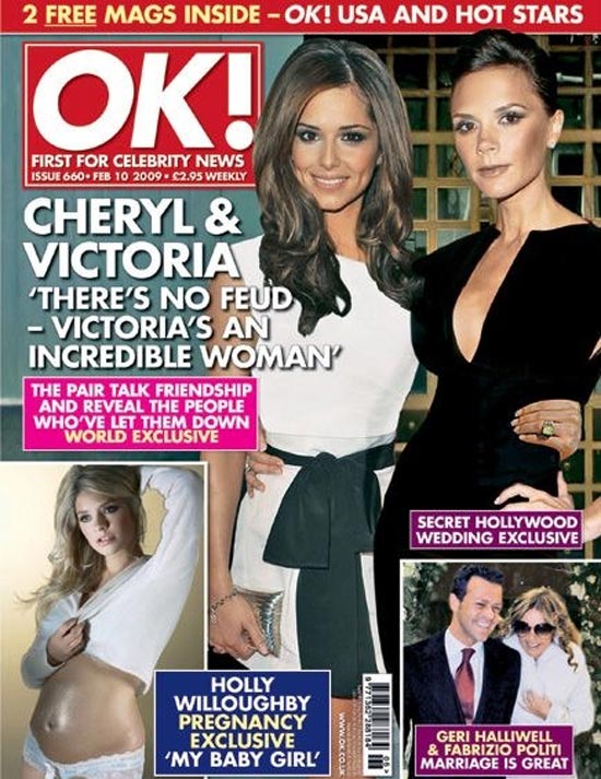
This magazine cover is aimed at an audience of around ages 18-60. This is because the pictures and cover lines are more about mature stories. The masthead is the most important part of this magazine as it tells you what the magazine is. The colours of the masthead really stand out which i think is why they picked it because it is easy to notice when it is on a rack in the shop. Having a masthead that is easily recognised is great for advertising. The dateline is placed underneath the masthead, this makes it easy to see the price and the date if issue. A magazine that is monthly will come out a at the end of the month before so it is in shops for the start of the next month. The main image is the picture at the top of Victoria and Cheryl, this is very noticable because it is the biggest. It also comes with a main cover line, this is the story in larger text, this means people will see that first and be interested. The text is white white means it stands out and also fits in with the colour scheme of the masthead/logo. The main cover line takes up alot of the page however on this magazine cover there is more than one image. There is also cover lines which dont take up as much room as the main text and isnt as easily noticable. there is an image to go with each cover line but they are smaller than the main image. The barcode is placed in the bottom right hand corner inbetween two images. The selling line is under the masthead and it reads 'first for celebrity news'. This makes the reader want to read about the stories inside first.
No comments:
Post a Comment